Psykoterapiakeskus
Rebranding & Web Design


Julia Kalinkina
Joensuu, Finland
Services
Webdesign
Branding
Copywriting
Overview
I redesigned the company website while simultaneously defining its visual identity. The goal was to create a calm, trustworthy, and accessible digital presence aligned with the expectations of a psychotherapy service.
Challenge
At the start of the project:
No defined brand system (colors, typography, visual style)
Only a logo existed
Website used harsh, high-contrast colors (bright red + dark green)
Visual tone did not match the emotional needs of users seeking therapy
👉 The biggest challenge:
Designing a calming experience while building the brand from scratch.
3. Goals
Create a soothing and trustworthy visual identity
Redesign the website for clarity and accessibility
Maintain professional distance (supportive, but not intrusive)
Ensure consistency across all content and imagery
Build a fully responsive experience
4. Research & Insights
I analyzed:
Psychotherapy websites
Medical service providers (both private & public)
International and Finnish competitors
Key insight:
Most successful therapy websites use soft contrast, natural tones, and minimal visual noise to reduce anxiety and build trust.
5. Brand Direction
Instead of a full rebrand, I refined the existing identity:
Color System
Primary: Soft greens (emerald, muted tones)
Accent: Red (used sparingly for interaction states)
Goal: Reduce visual stress while keeping recognizability
Typography
Combination of serif + sans-serif
Serif → warmth, human touch
Sans-serif → clarity, trust, readability
👉 This balance helped create both emotional comfort and professionalism
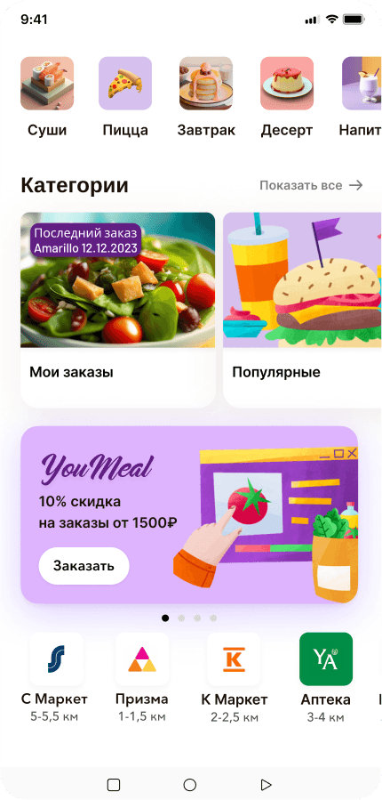
6. Visual Language
Carefully selected authentic, non-staged photography
Avoided overly intimate or “stock-like” imagery
Introduced hand-drawn illustrations for service explanations
Maintained a minimal and breathable layout
👉 Important nuance:
The design avoids being too clinical but also avoids being overly emotional or intrusive
7. UI Design
Key design principles:
Clean, distraction-free layouts
Clear content hierarchy
Gentle color transitions
Accessible typography and spacing
Interaction Design
Subtle hover states using accent color
Smooth and predictable navigation
Focus on reducing cognitive load
8. Responsiveness
Designed for multiple screen sizes
Ensured consistent experience across:
Desktop
Tablet
Mobile
Special attention was given to maintaining calm visual rhythm even on smaller screens.
9. Content & Consistency
Unified employee photography style
Standardized visual presentation across pages
Ensured tone of voice and visuals align
👉 This significantly improved perceived professionalism and trust.
10. Impact
Transformed the brand into a cohesive and calming experience
Improved alignment between visual design and service type
Created a scalable foundation for future updates
Strengthened trust and approachability for potential clients
11. Learnings
Designing for emotional contexts requires restraint, not decoration
Small visual changes (contrast, spacing, color tone) have big psychological impact
Brand and UI cannot be separated—especially in sensitive domains
Consistency builds trust faster than creativity alone


What’s next?


Julia Kalinkina
Joensuu, Finland
Psykoterapiakeskus Reilu Oy
Rebranding & Web Design

Psykoterapiakeskus
Rebranding & Web Design
Services
Webdesign
Branding
Copywriting
Overview
I redesigned the company website while simultaneously defining its visual identity. The goal was to create a calm, trustworthy, and accessible digital presence aligned with the expectations of a psychotherapy service.
Challenge
At the start of the project:
No defined brand system (colors, typography, visual style)
Only a logo existed
Website used harsh, high-contrast colors (bright red + dark green)
Visual tone did not match the emotional needs of users seeking therapy
👉 The biggest challenge:
Designing a calming experience while building the brand from scratch.
3. Goals
Create a soothing and trustworthy visual identity
Redesign the website for clarity and accessibility
Maintain professional distance (supportive, but not intrusive)
Ensure consistency across all content and imagery
Build a fully responsive experience
4. Research & Insights
I analyzed:
Psychotherapy websites
Medical service providers (both private & public)
International and Finnish competitors
Key insight:
Most successful therapy websites use soft contrast, natural tones, and minimal visual noise to reduce anxiety and build trust.
5. Brand Direction
Instead of a full rebrand, I refined the existing identity:
Color System
Primary: Soft greens (emerald, muted tones)
Accent: Red (used sparingly for interaction states)
Goal: Reduce visual stress while keeping recognizability
Typography
Combination of serif + sans-serif
Serif → warmth, human touch
Sans-serif → clarity, trust, readability
👉 This balance helped create both emotional comfort and professionalism
6. Visual Language
Carefully selected authentic, non-staged photography
Avoided overly intimate or “stock-like” imagery
Introduced hand-drawn illustrations for service explanations
Maintained a minimal and breathable layout
👉 Important nuance:
The design avoids being too clinical but also avoids being overly emotional or intrusive
7. UI Design
Key design principles:
Clean, distraction-free layouts
Clear content hierarchy
Gentle color transitions
Accessible typography and spacing
Interaction Design
Subtle hover states using accent color
Smooth and predictable navigation
Focus on reducing cognitive load
8. Responsiveness
Designed for multiple screen sizes
Ensured consistent experience across:
Desktop
Tablet
Mobile
Special attention was given to maintaining calm visual rhythm even on smaller screens.
9. Content & Consistency
Unified employee photography style
Standardized visual presentation across pages
Ensured tone of voice and visuals align
👉 This significantly improved perceived professionalism and trust.
10. Impact
Transformed the brand into a cohesive and calming experience
Improved alignment between visual design and service type
Created a scalable foundation for future updates
Strengthened trust and approachability for potential clients
11. Learnings
Designing for emotional contexts requires restraint, not decoration
Small visual changes (contrast, spacing, color tone) have big psychological impact
Brand and UI cannot be separated—especially in sensitive domains
Consistency builds trust faster than creativity alone
What’s next?
What’s next?