Weivi Oy
Rebranding & App Design


Julia Kalinkina
Joensuu, Finland
Services
Branding
UX/UI Design
Webdesign
Copywriting
Overview
I led a full rebranding initiative for Weivi Oy, including visual identity, marketing materials, and the foundation of the application’s UI system. The goal was to modernize the brand, ensure consistency, and support expansion to an international audience.
Challenge
The company faced several challenges:
Outdated and inconsistent branding
No existing UI/UX design for the product
Lack of design processes within the team
Difficulty communicating design decisions with a developer-only team
Additionally, the product itself was being defined during development, which created constant changes and ambiguity.
Design Direction & Concept
The visual identity was inspired by:
Nordic context (Finland)
Aurora Borealis (Northern Lights)
The meaning of “Vavi / Wavy” → fluidity, motion, transformation
This led to a concept built around:
Gradient-based visuals (reflecting shifting light waves)
Cool tones: blue, turquoise, green
Dark base (black) for contrast and modern feel
Results
Most new users made their first investment
Fewer people needed help
Users felt more confident
People kept using the app longer
Visual Identity
Key decisions:
Color palette: Black + aurora-inspired gradients
Typography: Bold sans-serif for clarity and modern tone
Visual language: Smooth transitions, gradients, and flow
Applied across:
Presentations
Documentation
Business cards
Website (in progress)
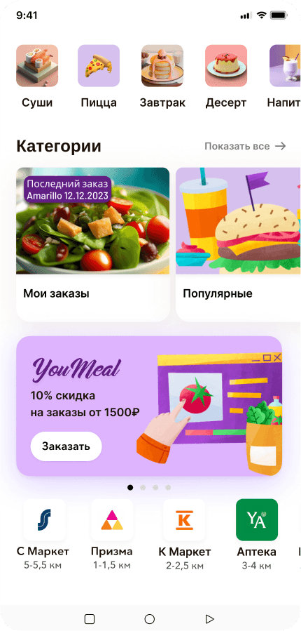
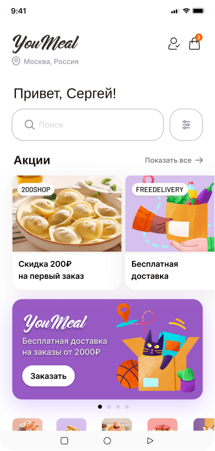
6. UI System & Product Design
Since no UI existed, I:
Designed the application from scratch
Created initial UI components and patterns
Focused on desktop-first design due to product context
Key priorities:
Clarity and usability
Consistency across screens
Scalability for future development
7. Collaboration & Constraints
Worked with frontend & backend developers without design background
Translated design decisions into practical implementation
Adapted to continuously evolving product requirements
8. Research & Validation
Analyzed competitors and adjacent industries
Ensured the brand fits the market but still stands out
Collected feedback from:
Partners
Customers
Internal stakeholders
9. Impact
Established the first unified design direction for the company
Improved brand perception toward a modern, international standard
Created the foundation for a scalable UI system
Enabled better collaboration between design and development
. Learnings
Iteration is critical when designing from scratch
Early and frequent feedback prevents misalignment
Introducing design into a non-design team requires communication, not just execution
Building systems early saves time later


What’s next?


Julia Kalinkina
Joensuu, Finland
Weivi Oy
Rebranding & App design


Weivi Oy
Rebranding & App design

Services
Branding
UX/UI Design
Webdesign
Copywriting
Overview
I led a full rebranding initiative for Weivi Oy, including visual identity, marketing materials, and the foundation of the application’s UI system. The goal was to modernize the brand, ensure consistency, and support expansion to an international audience.
Challenge
The company faced several challenges:
Outdated and inconsistent branding
No existing UI/UX design for the product
Lack of design processes within the team
Difficulty communicating design decisions with a developer-only team
Additionally, the product itself was being defined during development, which created constant changes and ambiguity.
Design Direction & Concept
The visual identity was inspired by:
Nordic context (Finland)
Aurora Borealis (Northern Lights)
The meaning of “Vavi / Wavy” → fluidity, motion, transformation
This led to a concept built around:
Gradient-based visuals (reflecting shifting light waves)
Cool tones: blue, turquoise, green
Dark base (black) for contrast and modern feel
Results
Most new users made their first investment
Fewer people needed help
Users felt more confident
People kept using the app longer
Visual Identity
Key decisions:
Color palette: Black + aurora-inspired gradients
Typography: Bold sans-serif for clarity and modern tone
Visual language: Smooth transitions, gradients, and flow
Applied across:
Presentations
Documentation
Business cards
Website (in progress)
6. UI System & Product Design
Since no UI existed, I:
Designed the application from scratch
Created initial UI components and patterns
Focused on desktop-first design due to product context
Key priorities:
Clarity and usability
Consistency across screens
Scalability for future development
7. Collaboration & Constraints
Worked with frontend & backend developers without design background
Translated design decisions into practical implementation
Adapted to continuously evolving product requirements
8. Research & Validation
Analyzed competitors and adjacent industries
Ensured the brand fits the market but still stands out
Collected feedback from:
Partners
Customers
Internal stakeholders
9. Impact
Established the first unified design direction for the company
Improved brand perception toward a modern, international standard
Created the foundation for a scalable UI system
Enabled better collaboration between design and development
. Learnings
Iteration is critical when designing from scratch
Early and frequent feedback prevents misalignment
Introducing design into a non-design team requires communication, not just execution
Building systems early saves time later
What’s next?
What’s next?